2>3
AI & WEB3 INFRASTRUCTURE
Zero-to-One Brand Building & Long-Term Stewardship
Arcium
2024-26
Role
Lead Designer
17x - X (Twitter) audience growth. Daily social design across the brand's growth.
398K - Participants in Arcium Citadel Quest. Full visual identity built end-to-end, from landing pages to NFT to social.
BRANDING PHASE 1
THE CHALLENGE
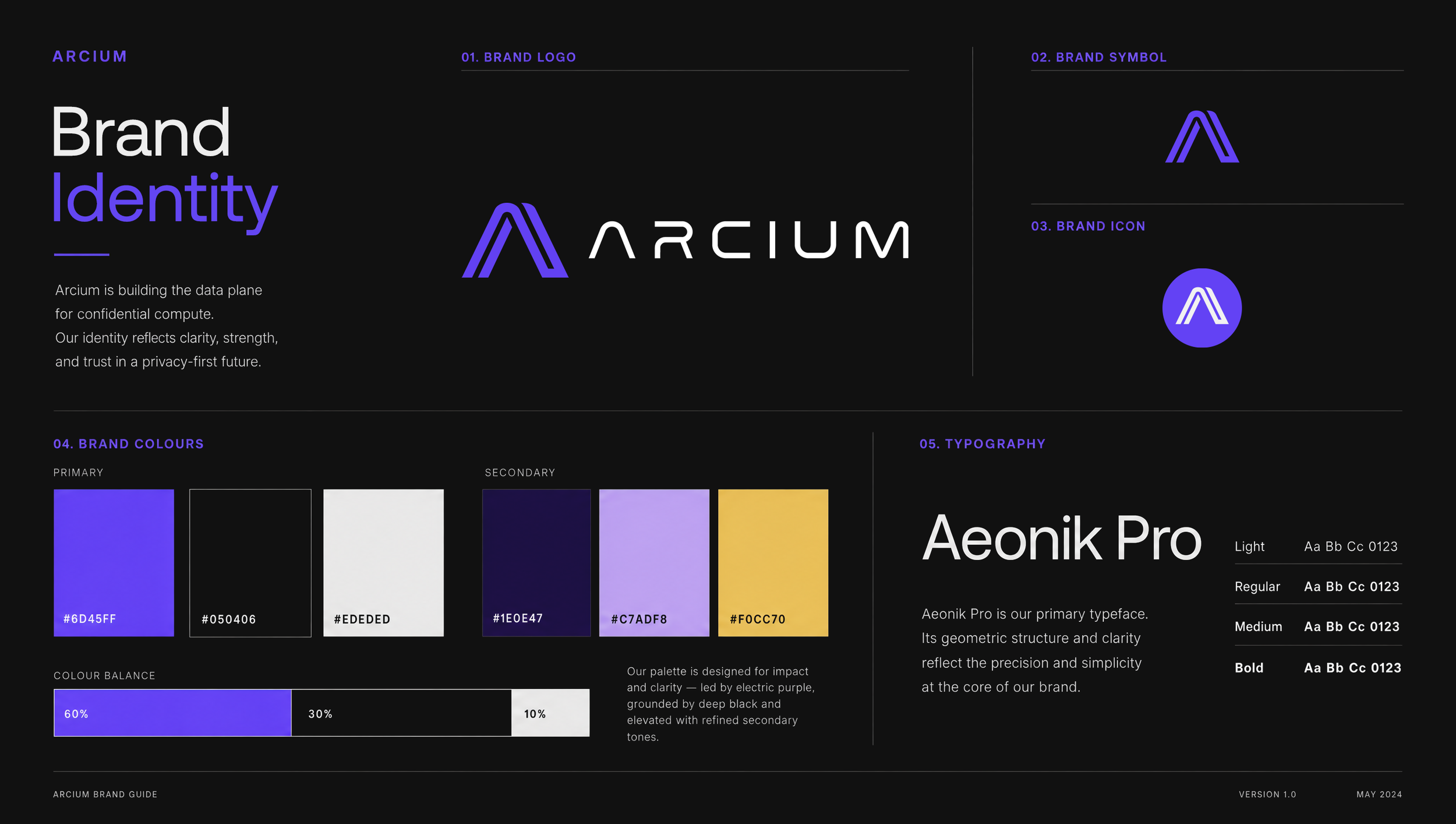
After the pivot from Elusiv to Arcium, the brand needed a foundation first: logo, color, typeface, a system it could grow from. The harder problem sat underneath it. Encrypted data is written in a language that doesn't exist: scrambled letters and numbers nobody was ever meant to read. How do you give an identity to something built to be unreadable?
THE IDEA
Decision: I chose to take the unreadable and make it readable. Encrypted data, given a form anyone could look at and understand: any object, any shape, built out of scrambled letters and numbers. A literal translation of what encryption actually is, not decoration. This was also where I started directing generative AI daily, the beginning of what's now three years of that practice.
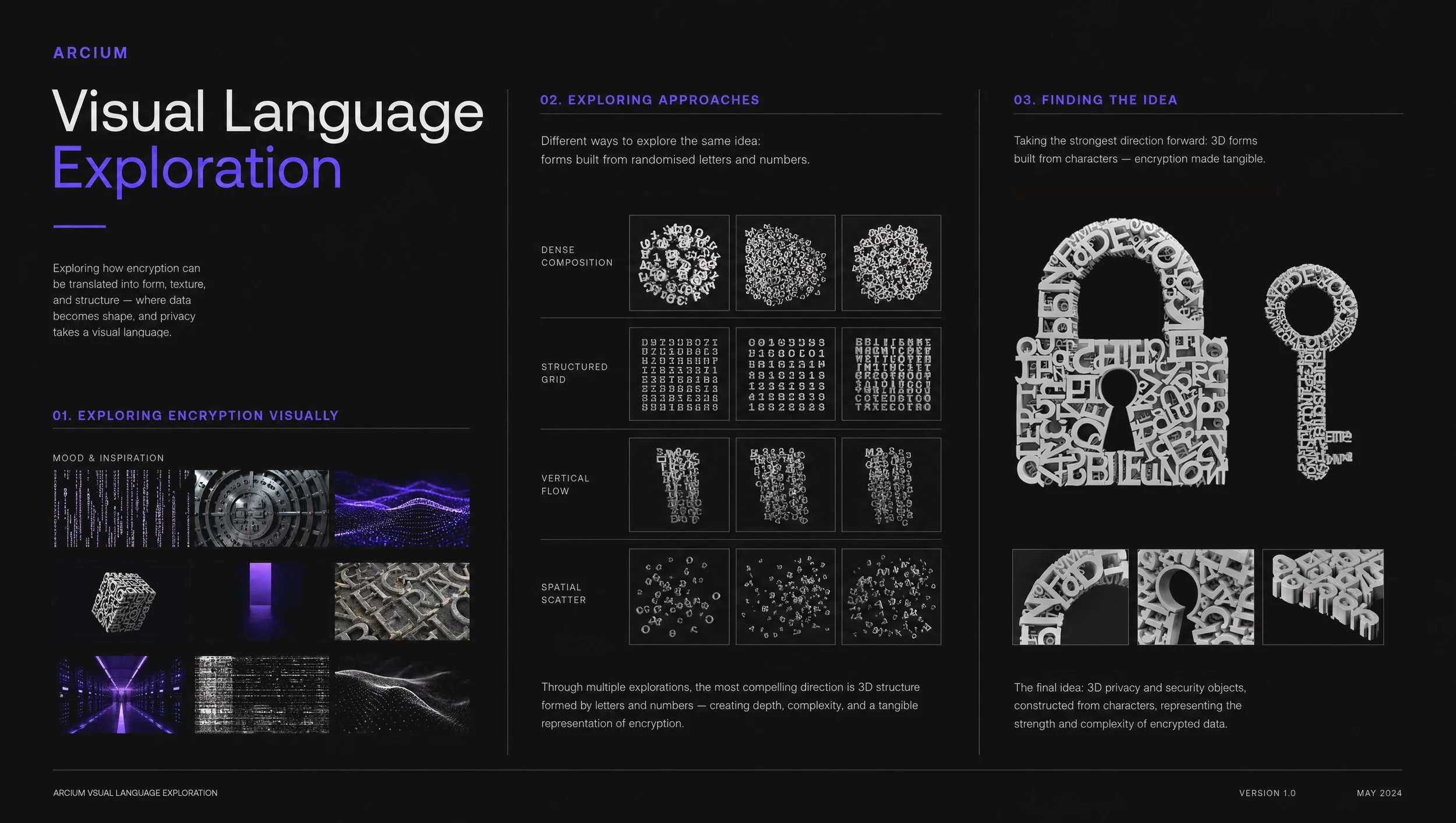
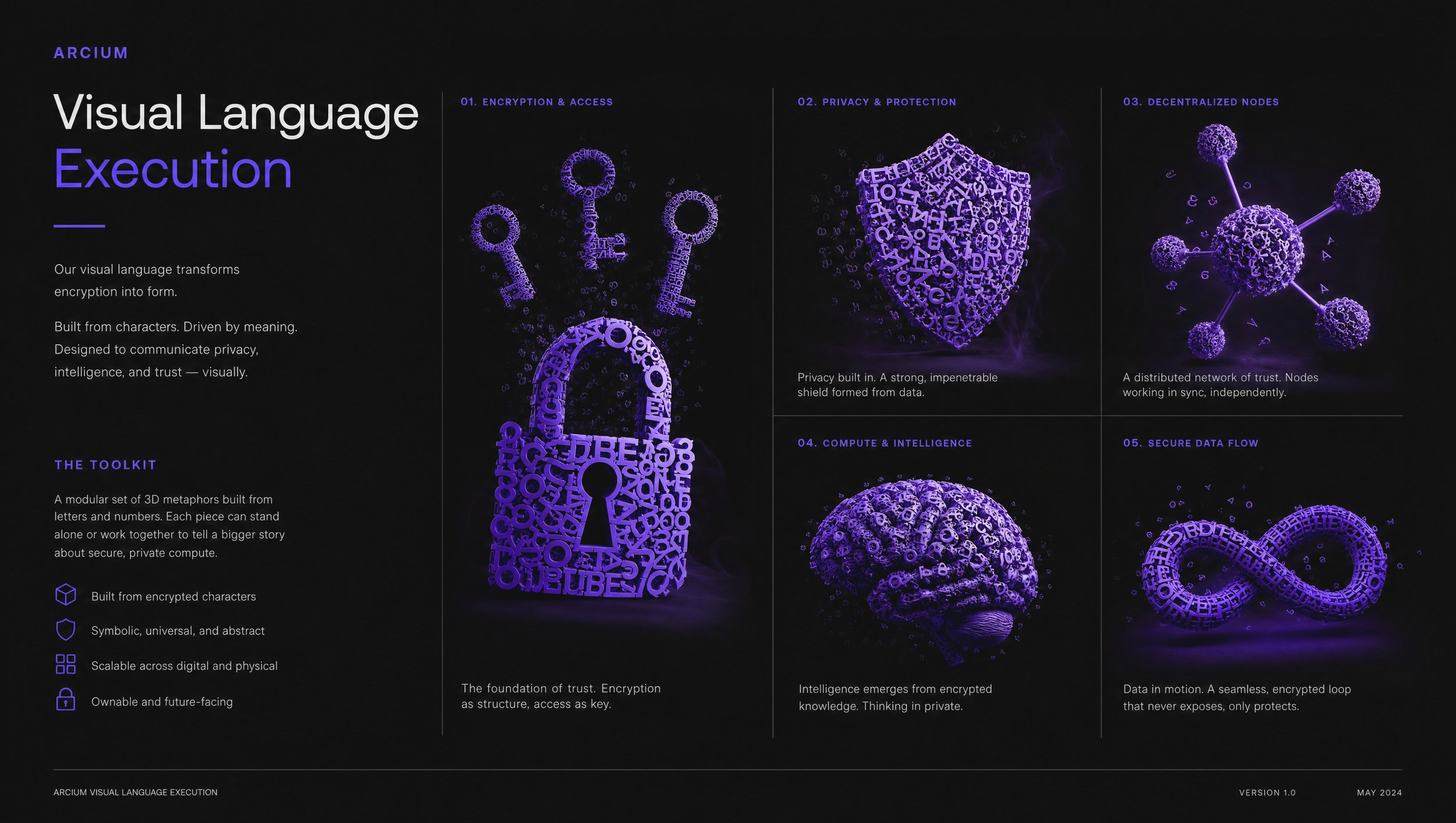
THE CRAFT
Hundreds of scrambled letters and numbers, one language. Once the idea was proven, the work became refinement: polishing the system into 3D visual assets precise enough to become the brand's actual toolkit.
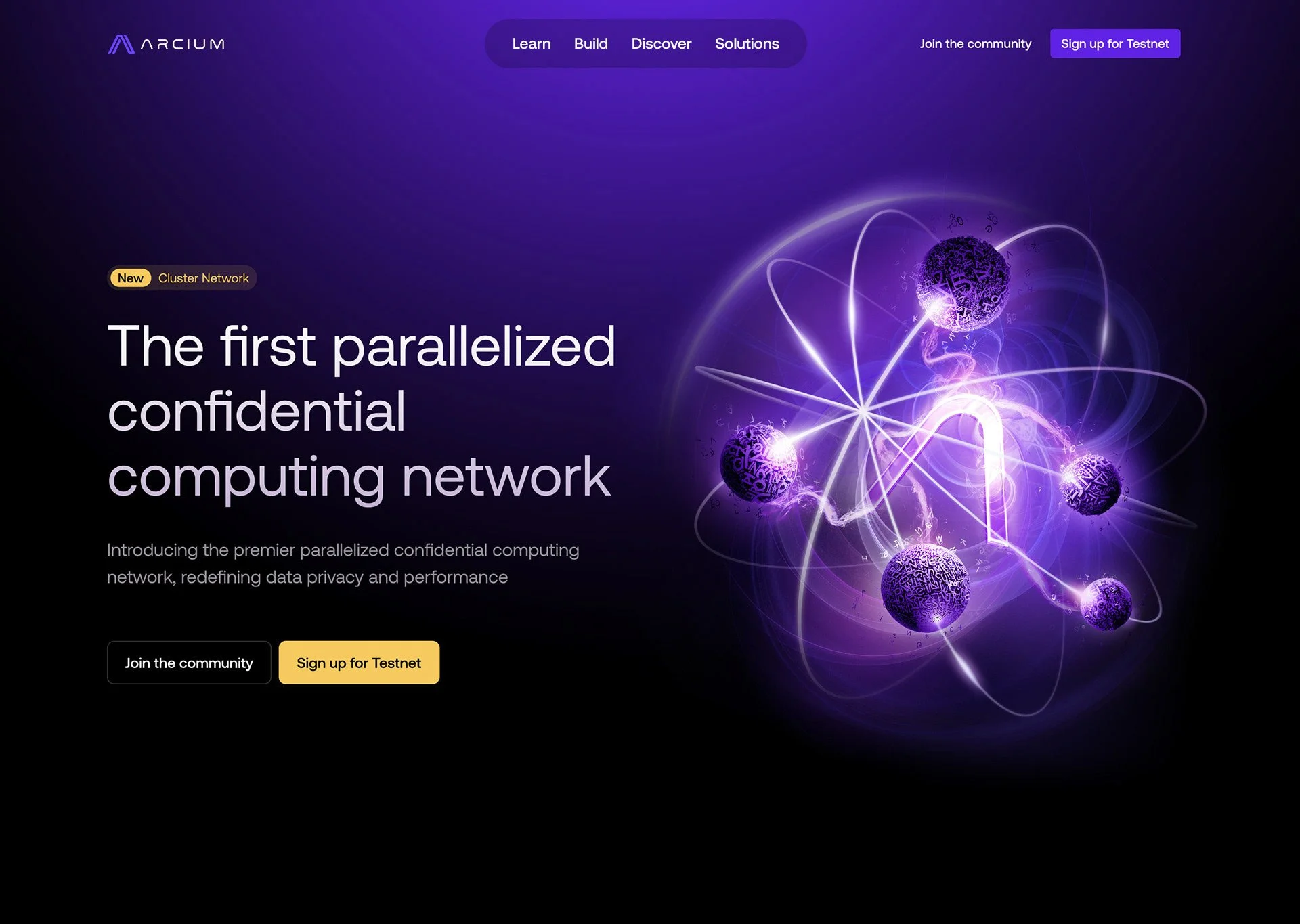
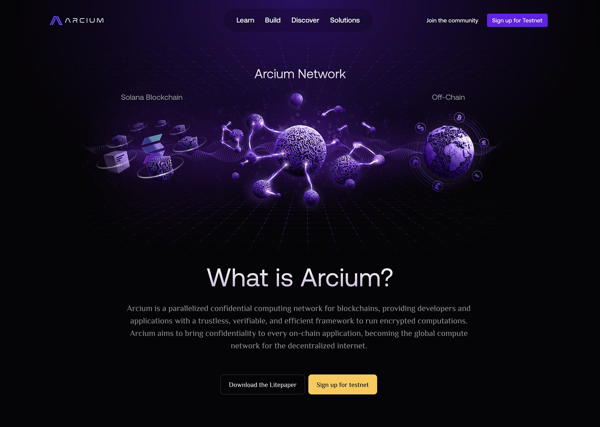
The World
The language needed somewhere to live. On the website and across social, it became Arcium's everyday visual language, the one people would meet first, and most often.
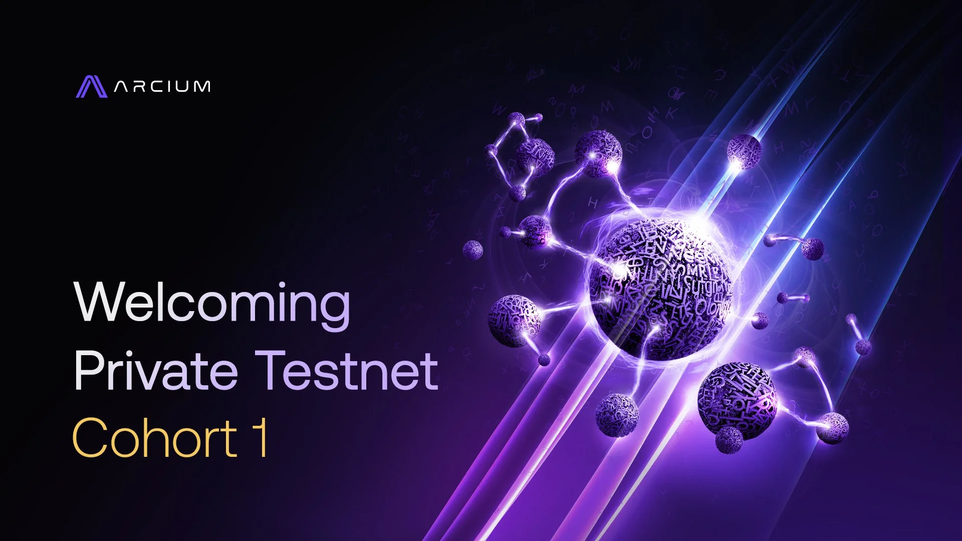

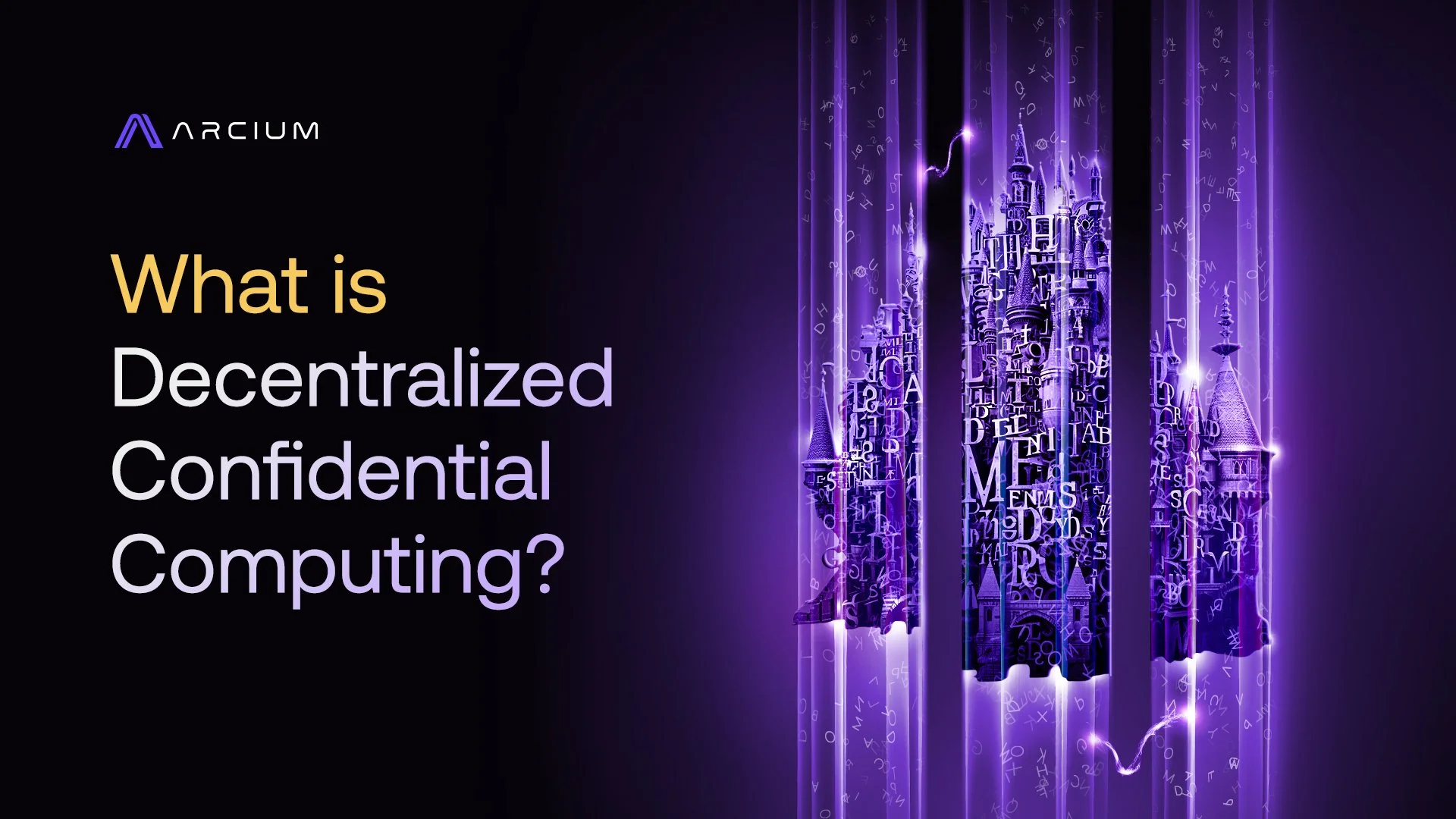
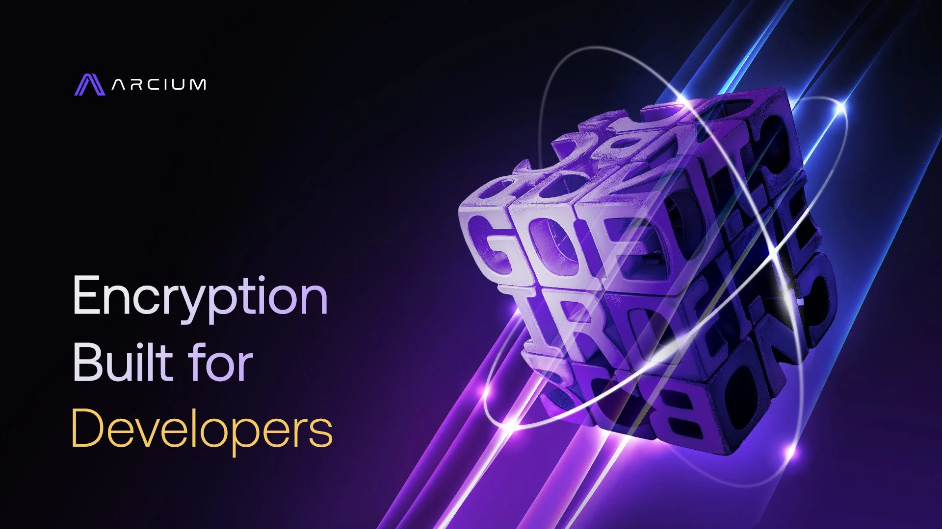
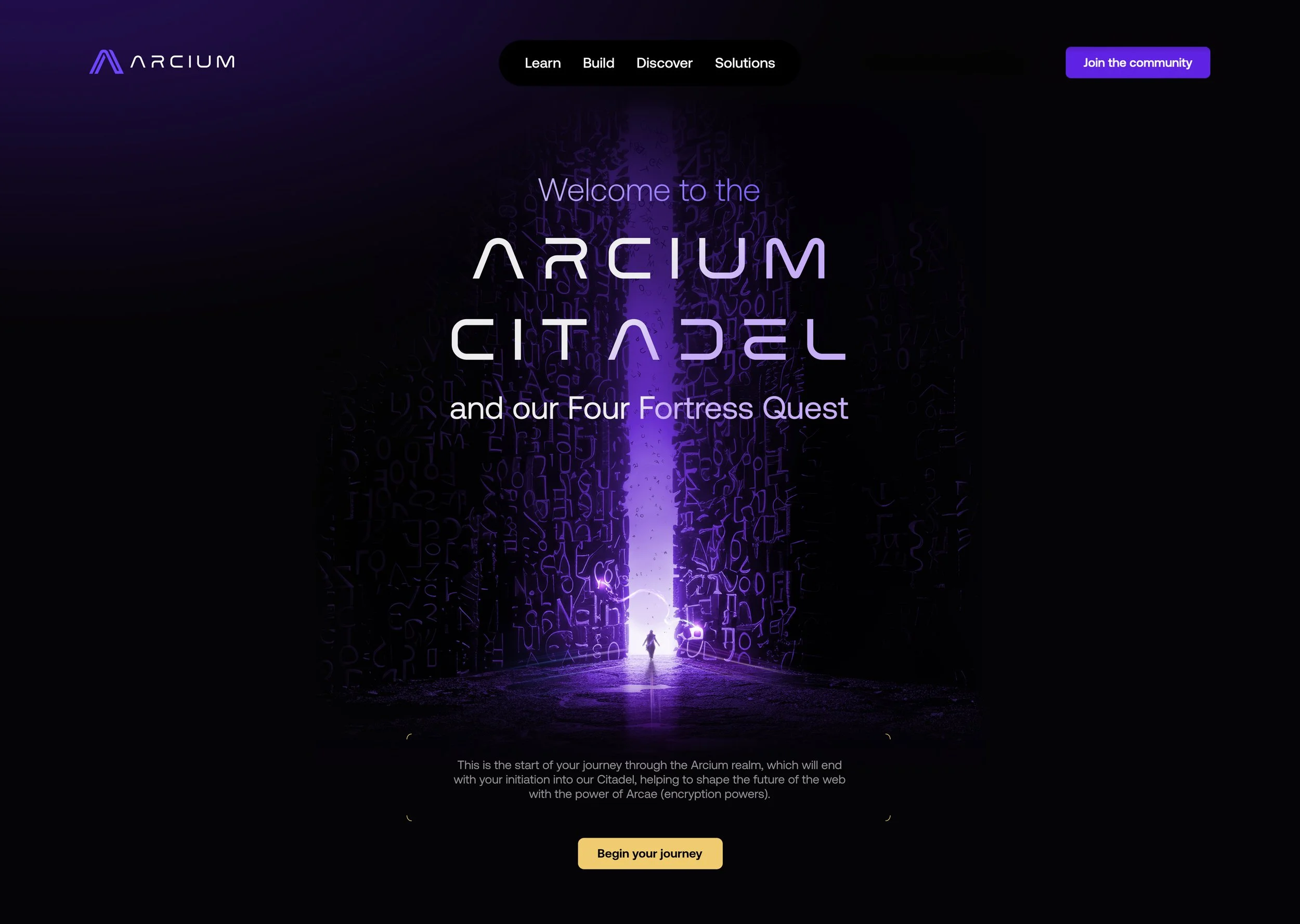
Arcium Citadel and The Four Fortresses Quest
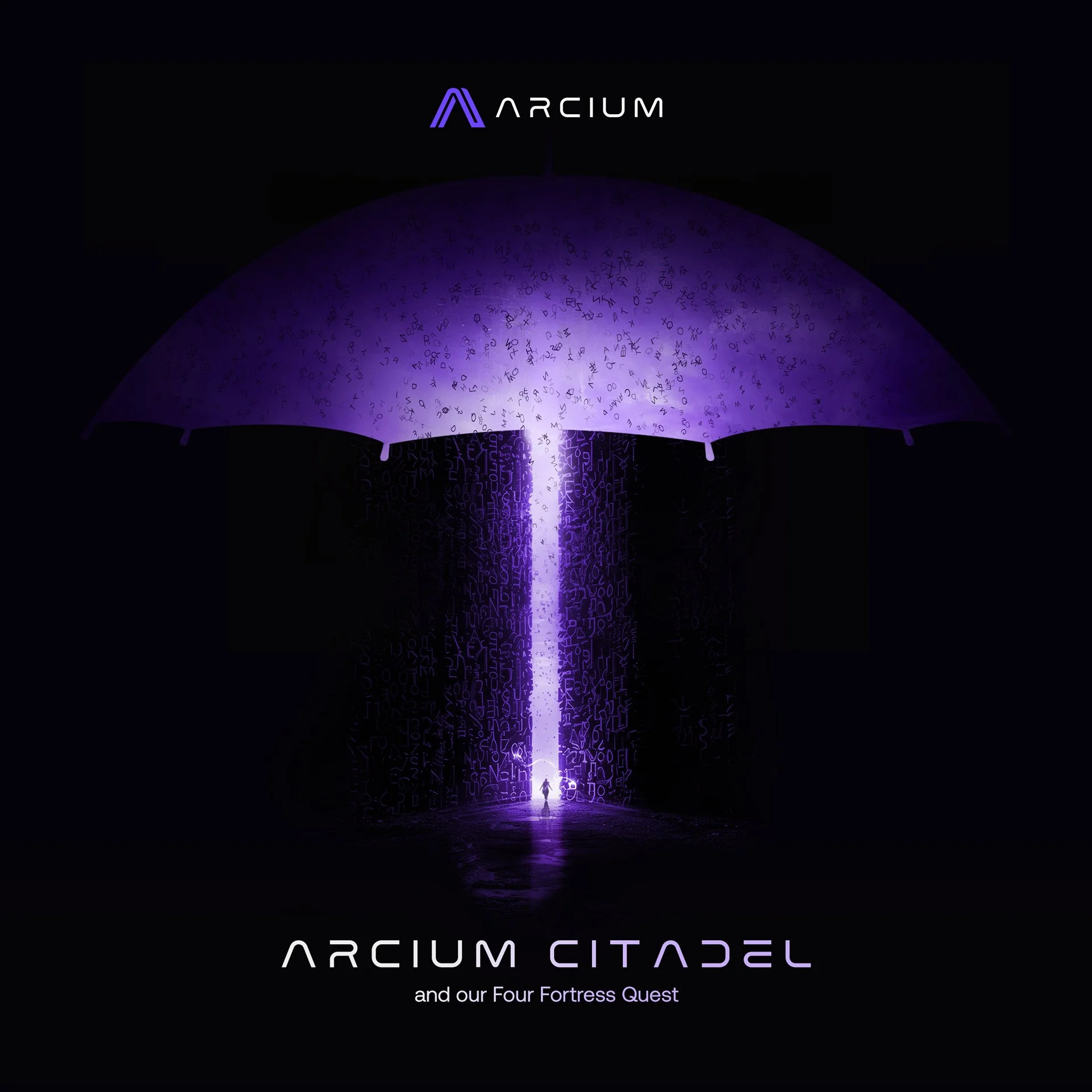
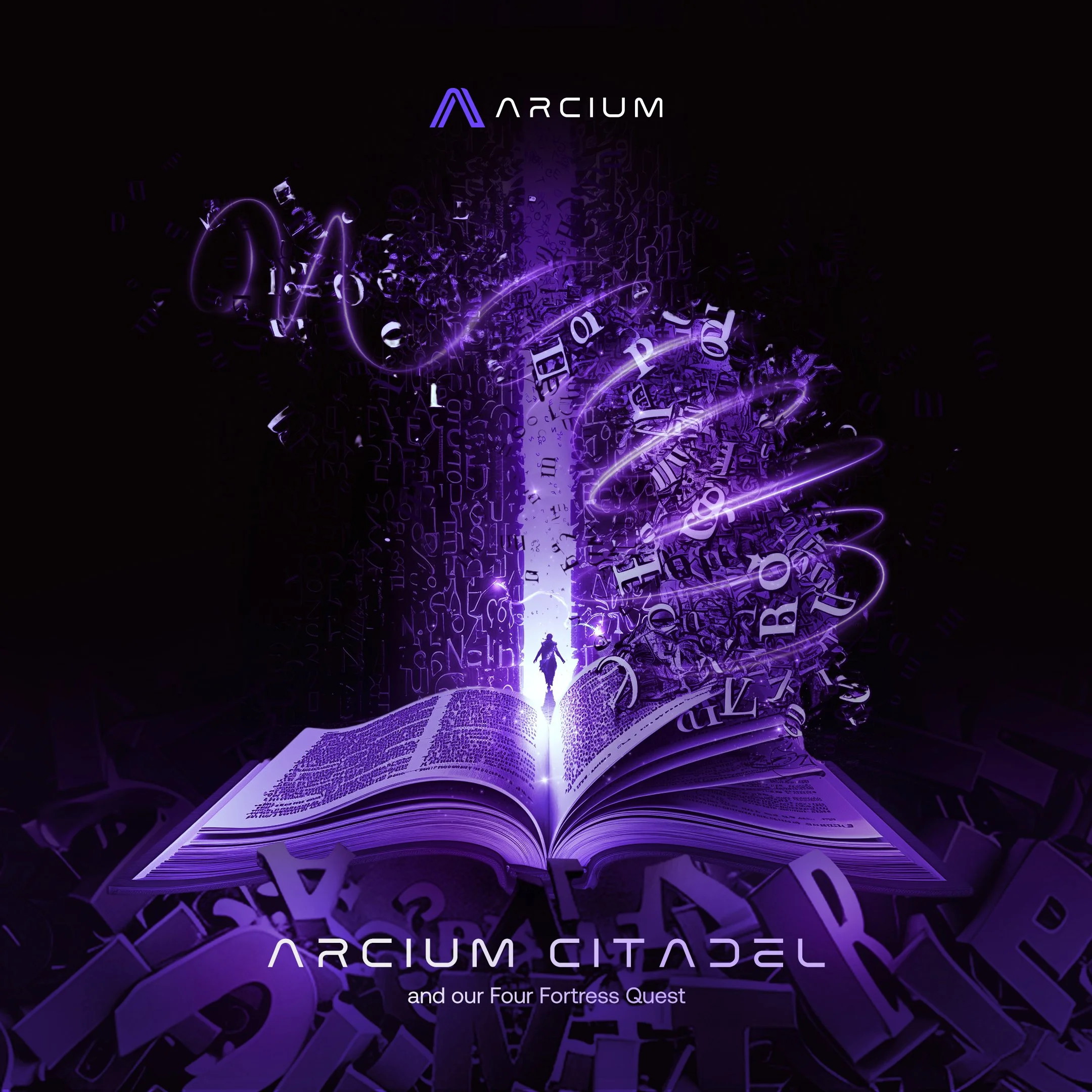
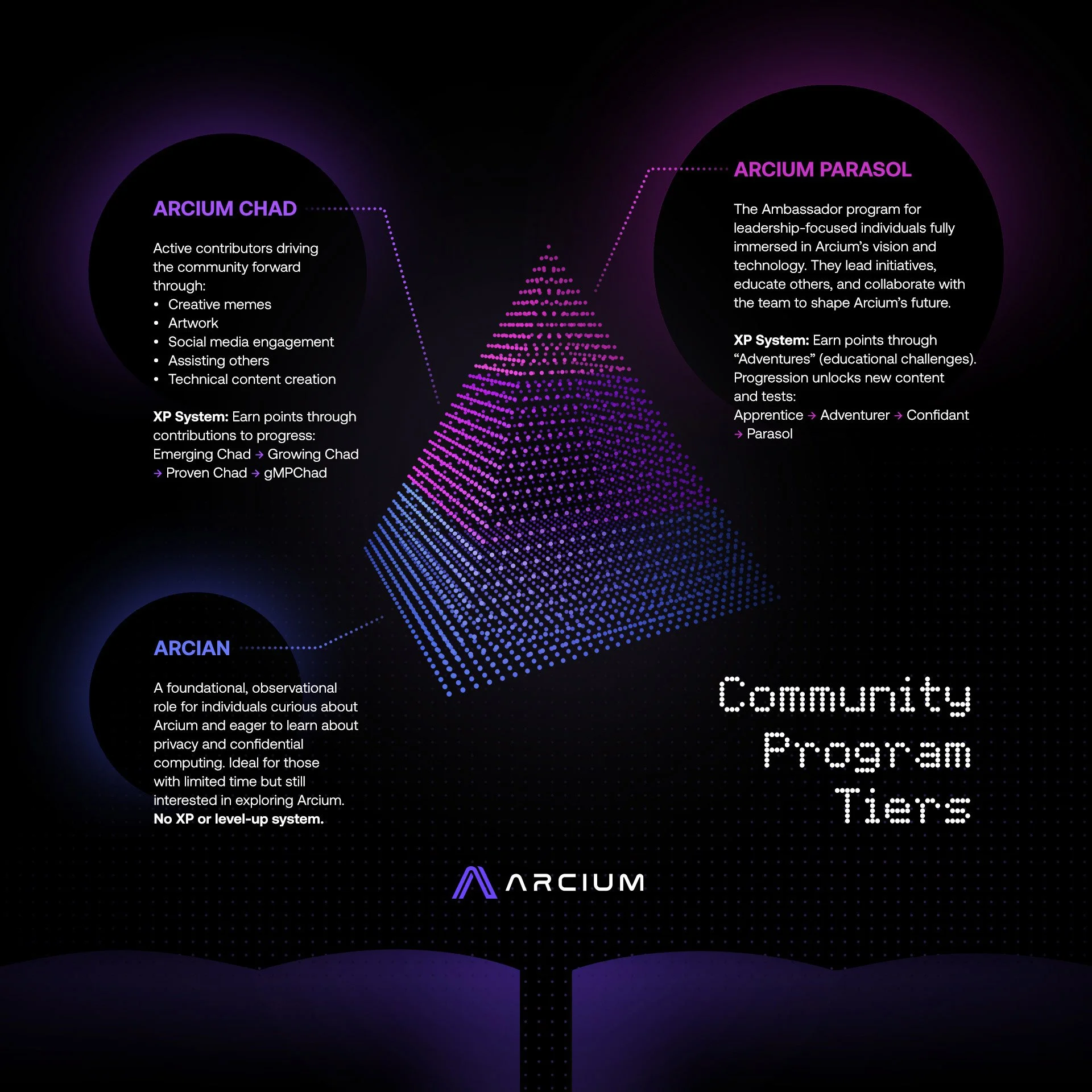
Arcium turned its own technology into a kingdom: the Citadel, four fortresses, newcomers earning their way through as "Apprentices" toward core membership.
Decision: I gave this kingdom its shape end to end, from landing pages and NFT design to the social designs and animations that carried it.
398,000 people walked through it.
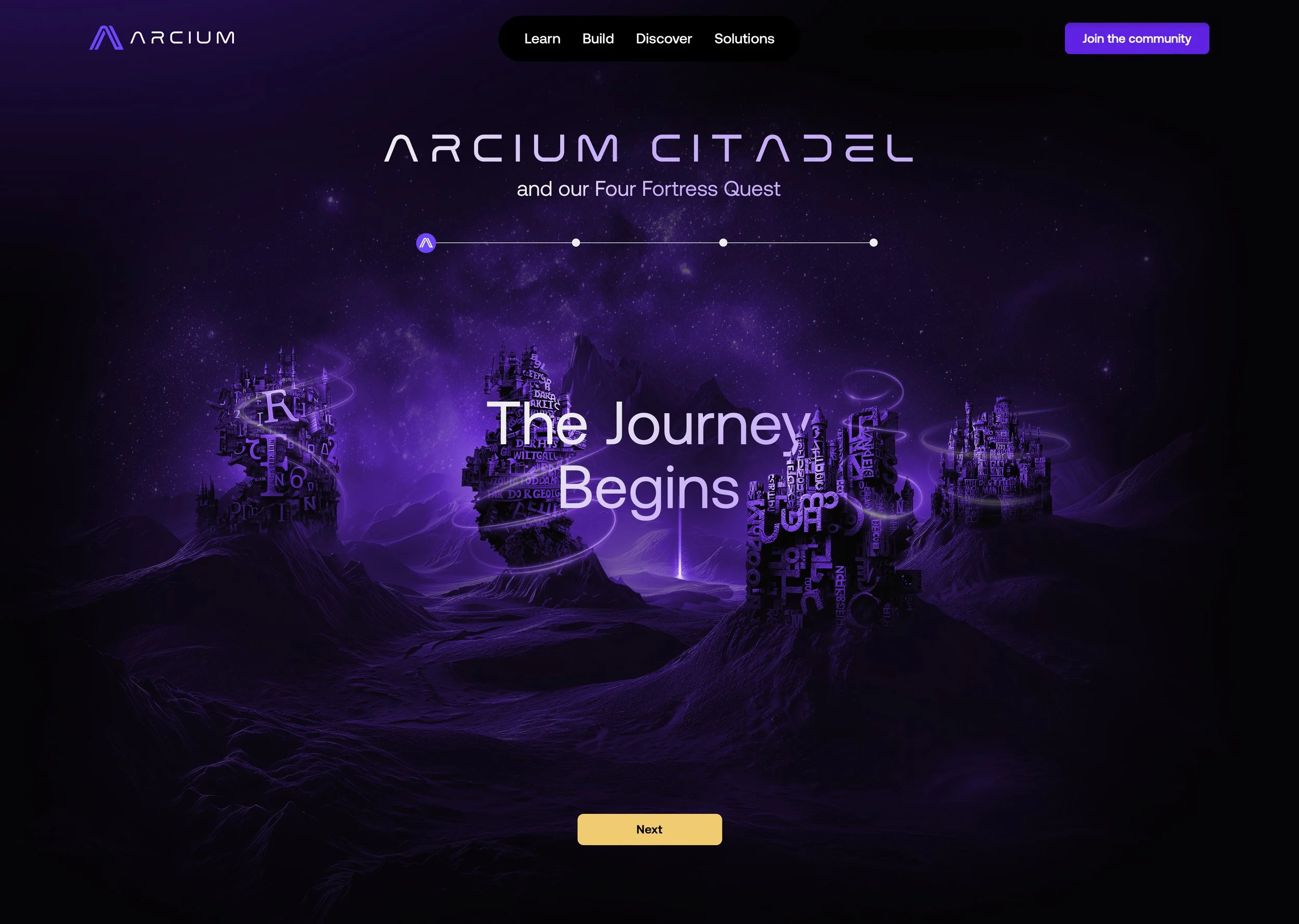
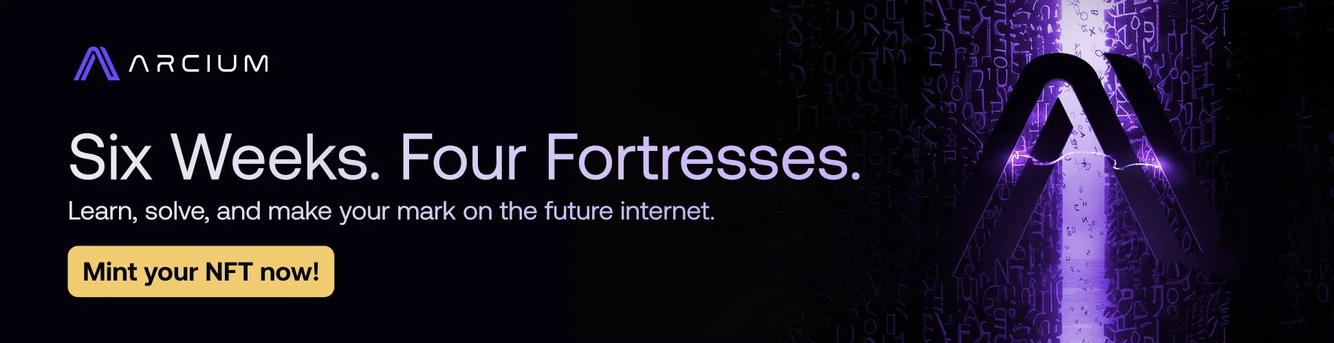
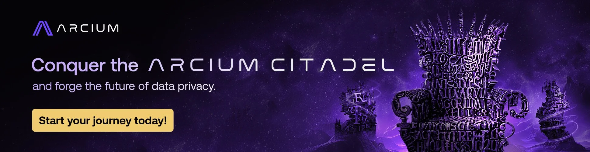
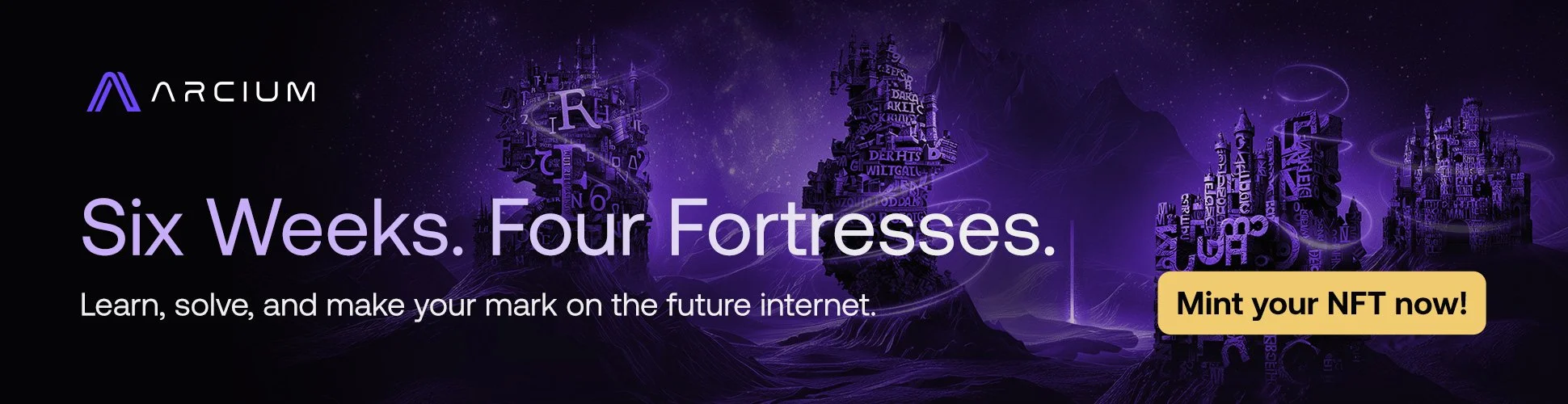
NFT design
Samples of the NFT series are collectible at each milestone of the quest.
BRANDING PHASE 2
THE CHALLENGE
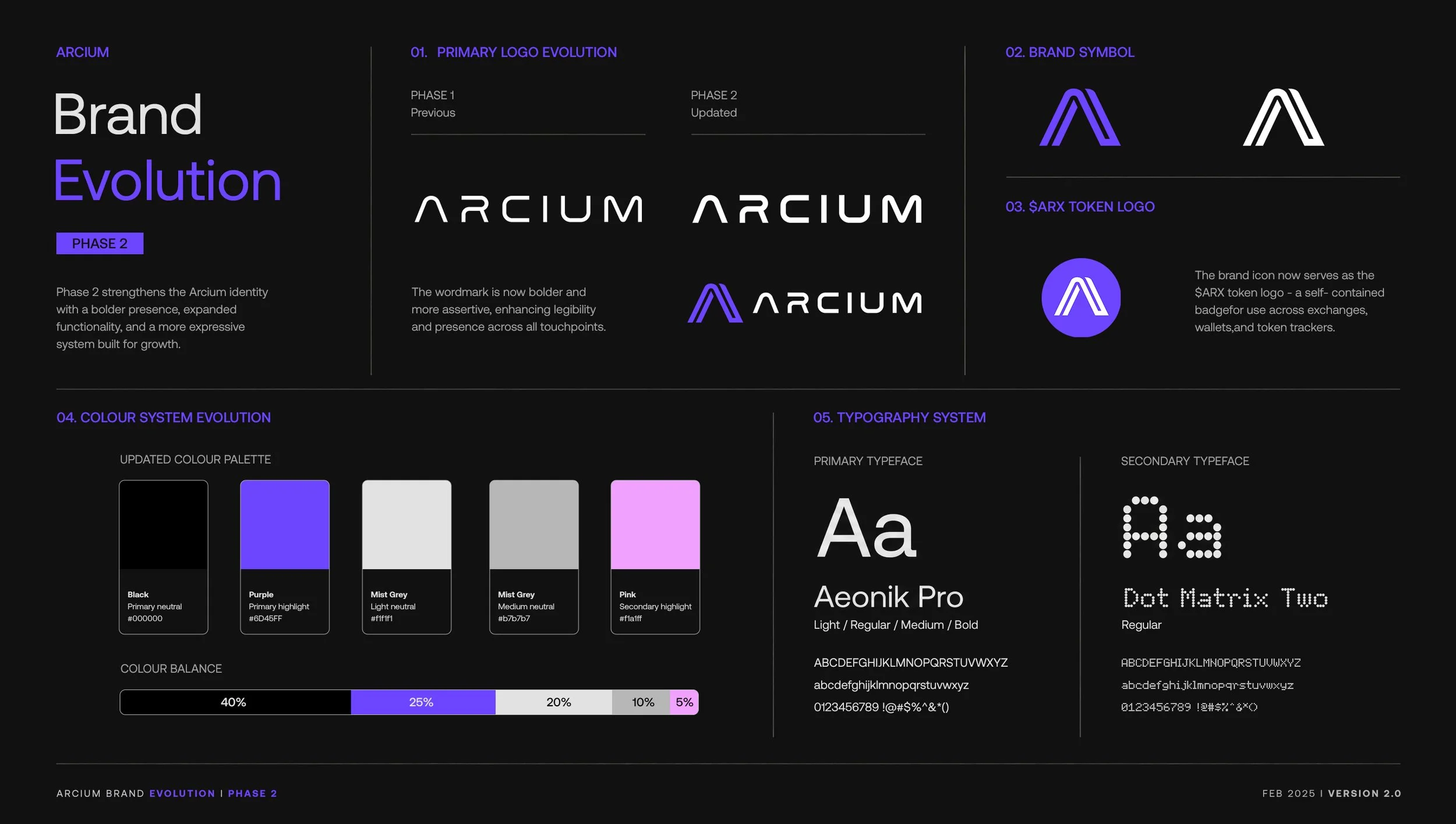
The brand evolved: logo, color, and typeface all updated. What changed most was how it spoke to the people already inside it. Arcium's community wasn't decoding encryption for the first time anymore; they were already fluent in it. The visual language needed to grow up with them.
THE IDEA
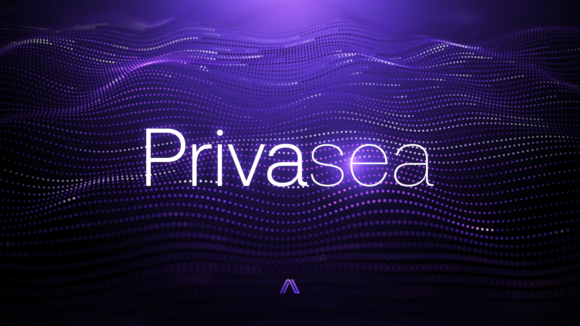
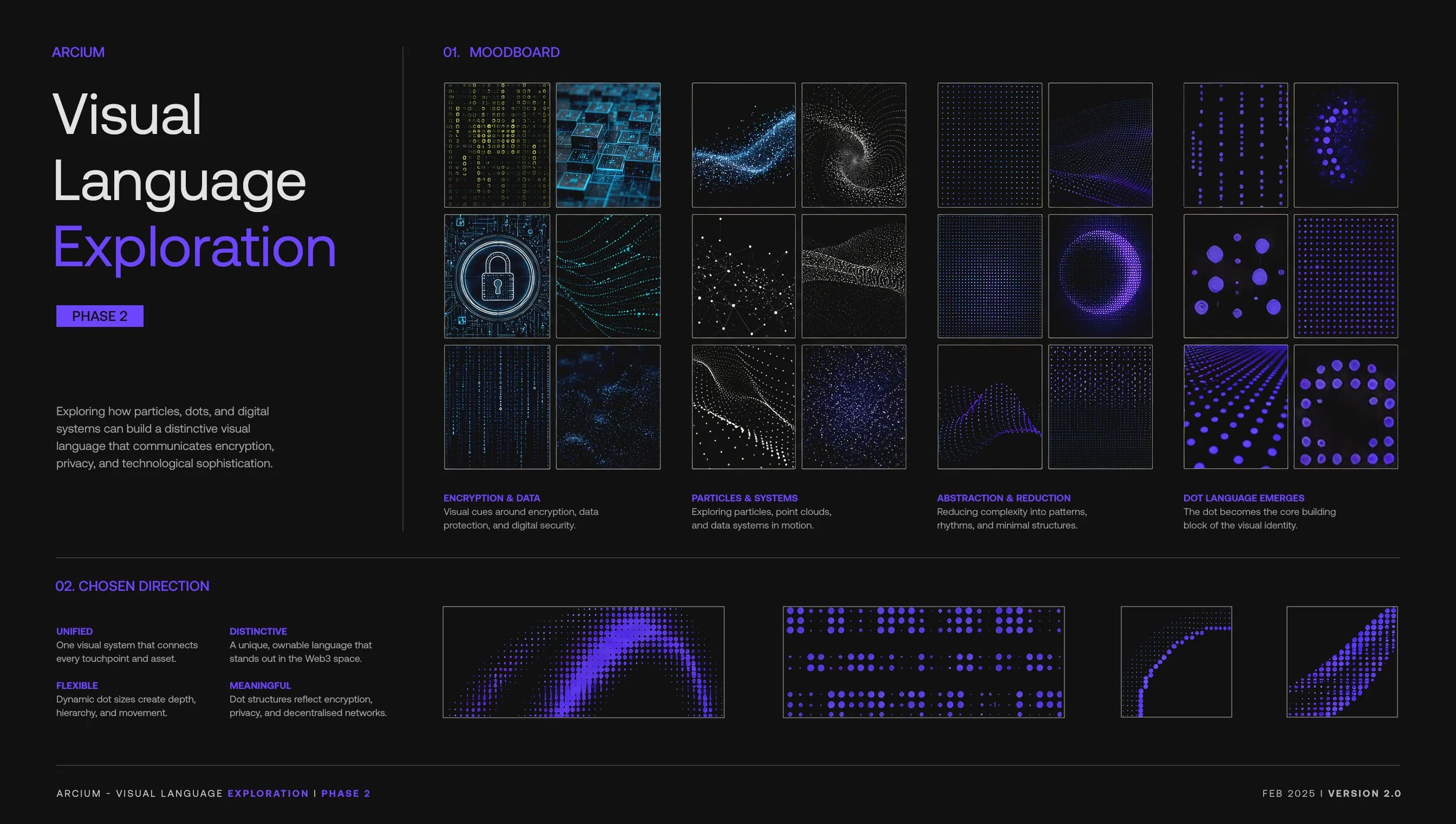
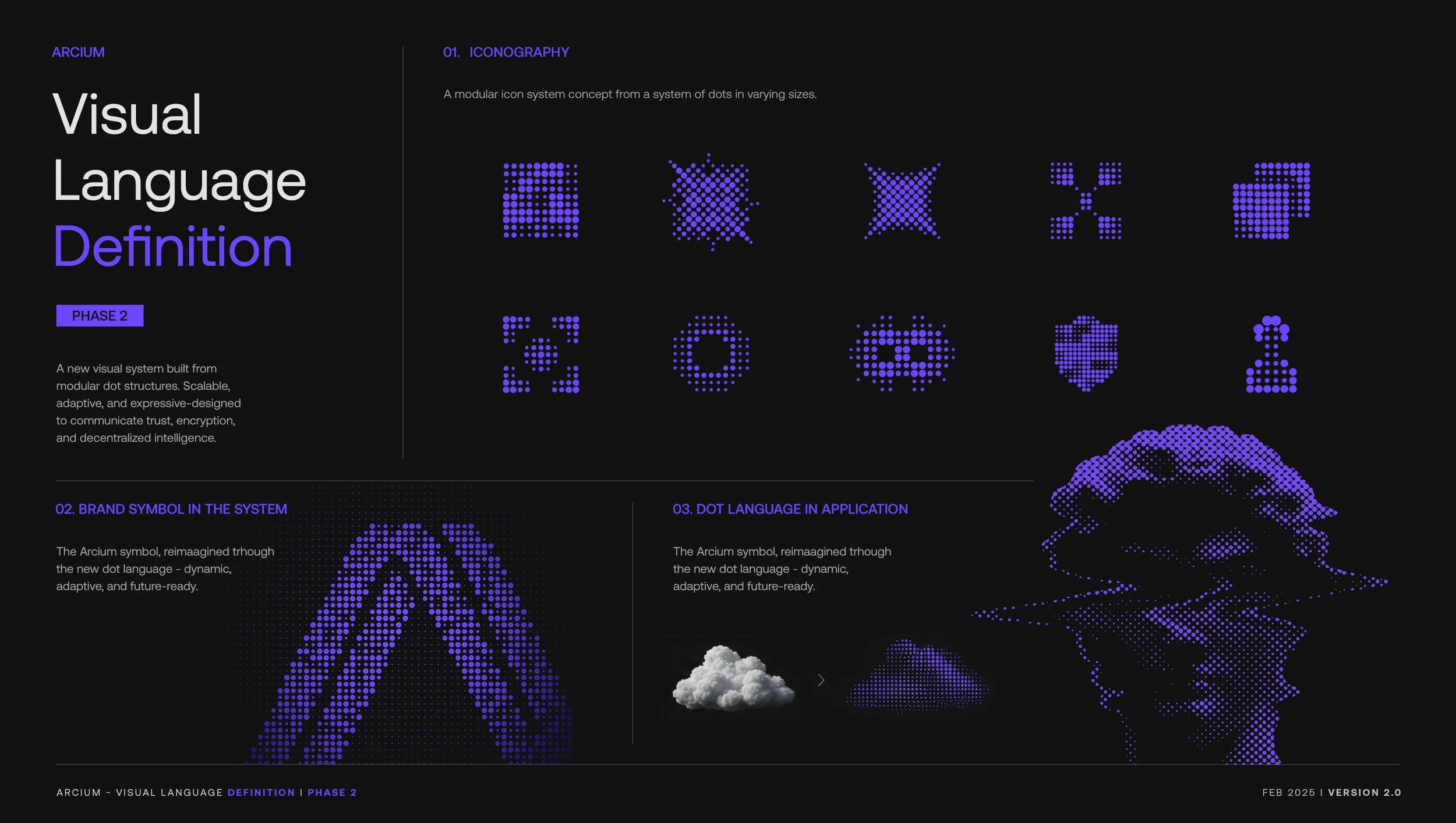
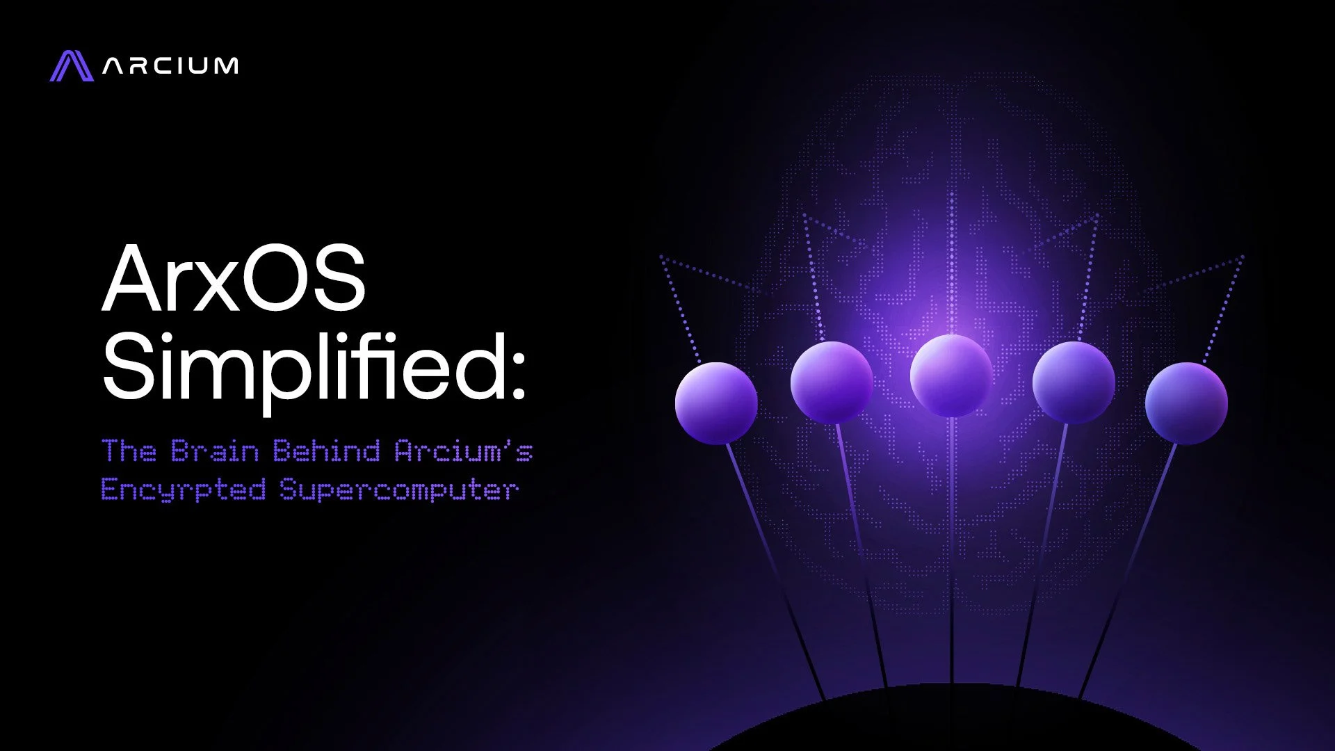
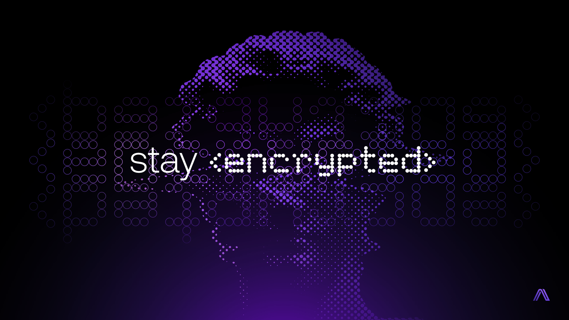
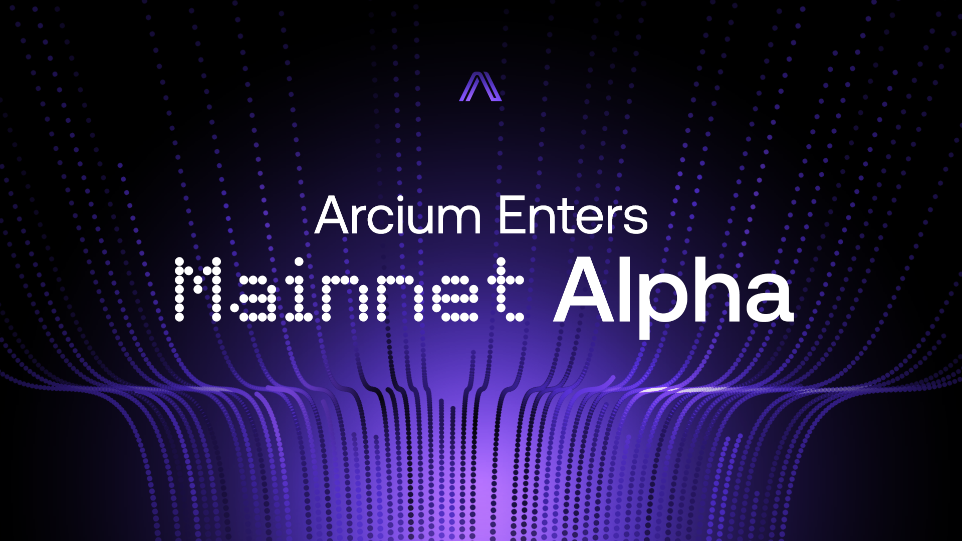
Decision: Letters and numbers became dots: a system we called braille, the right metaphor to grow into, since braille itself makes the unreadable readable for people who need a different way in. The dots carried more meaning than the original code ever did: encryption, but also the nodes of the network, the stream of data moving through it. Getting there took real testing and research, not a quick reskin.
THE CRAFT
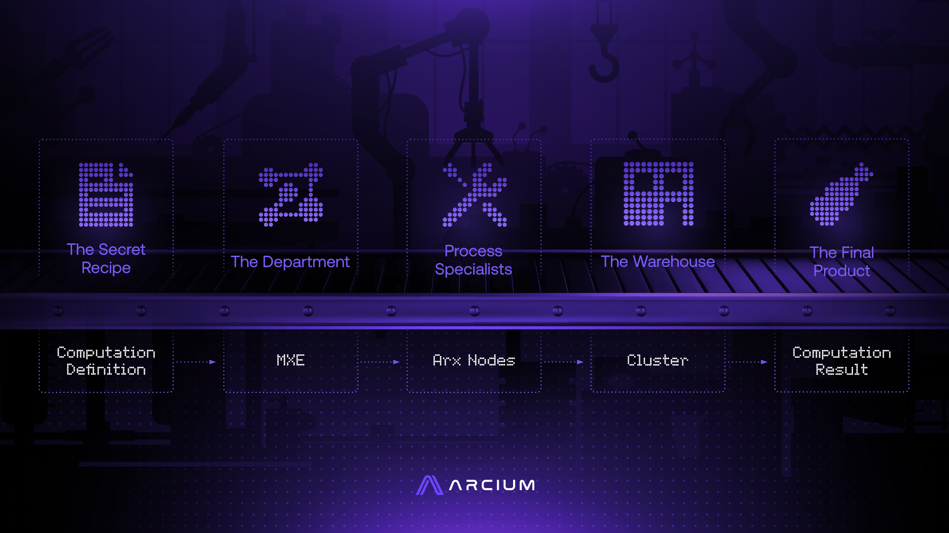
The dot system, defined: an iconography built entirely from the new direction, flatter and more abstract, speaking fluently to an audience who already knew the language of privacy.
The World
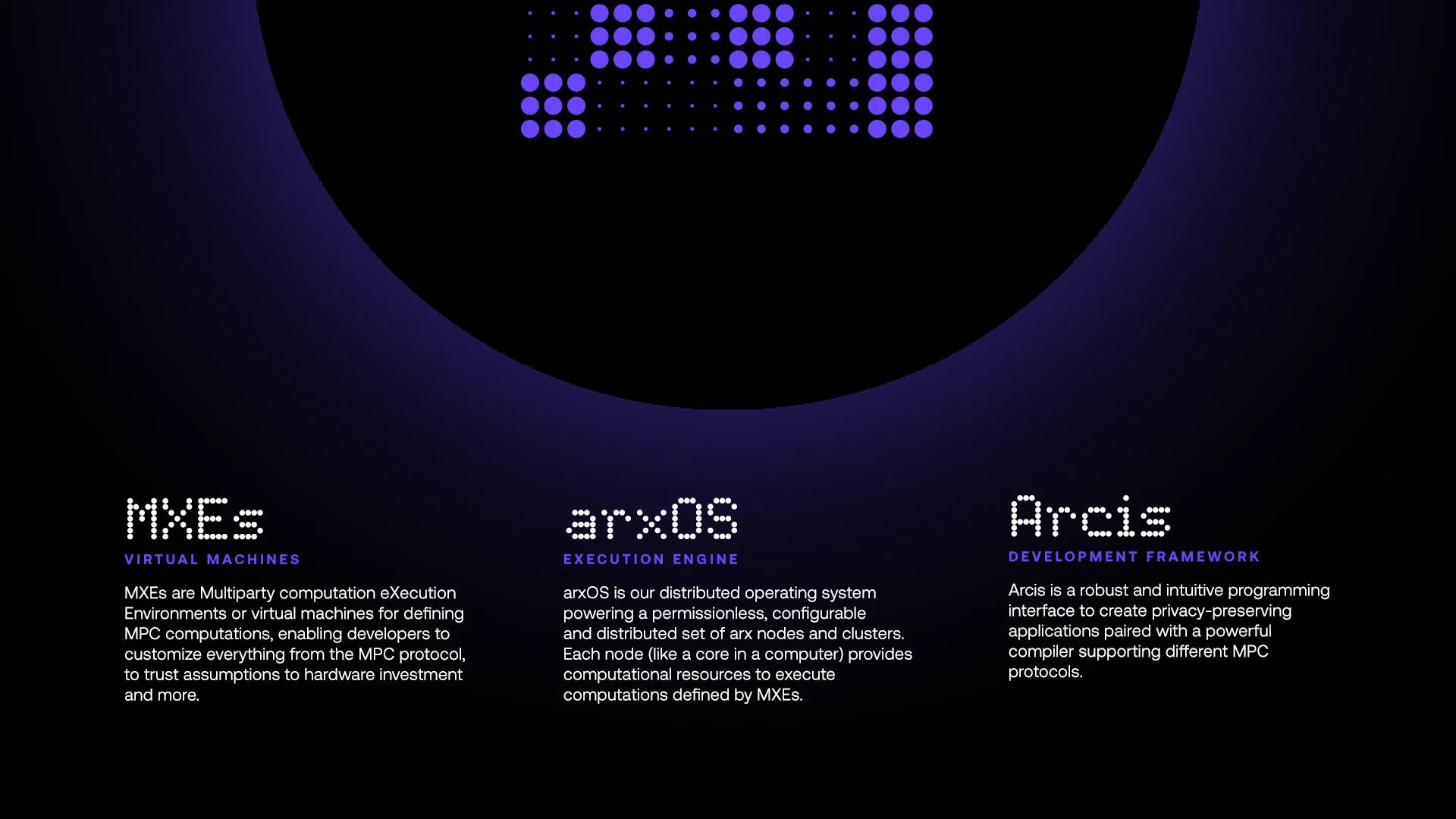
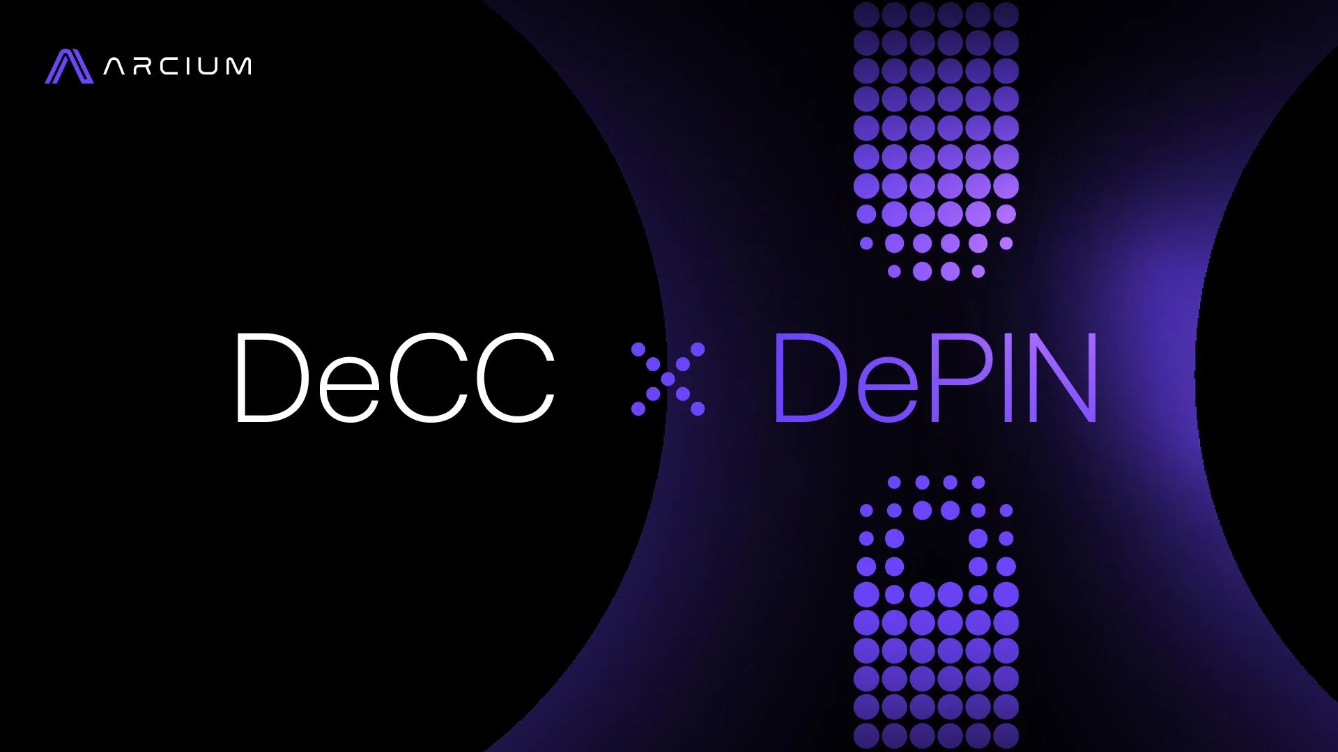
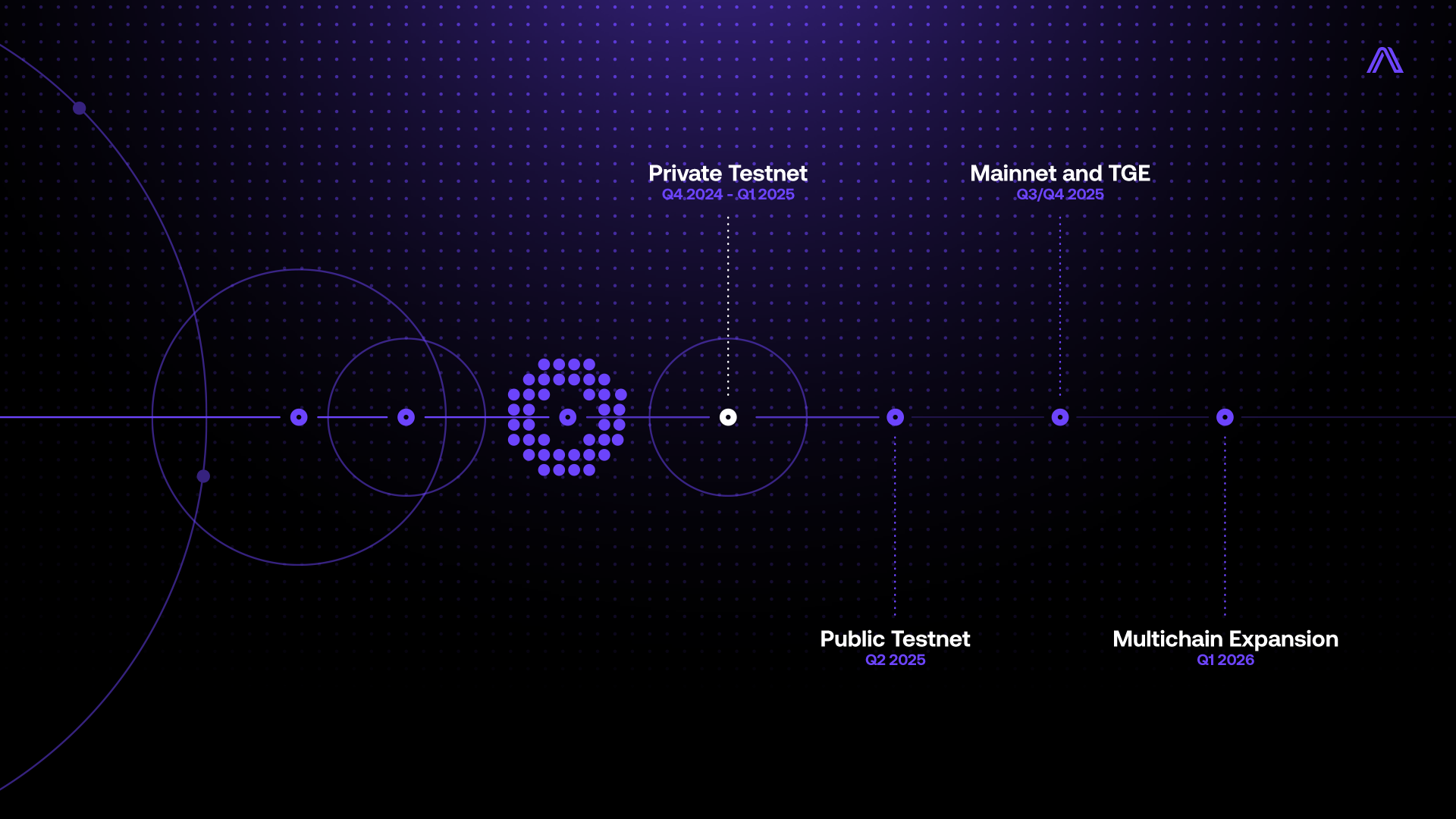
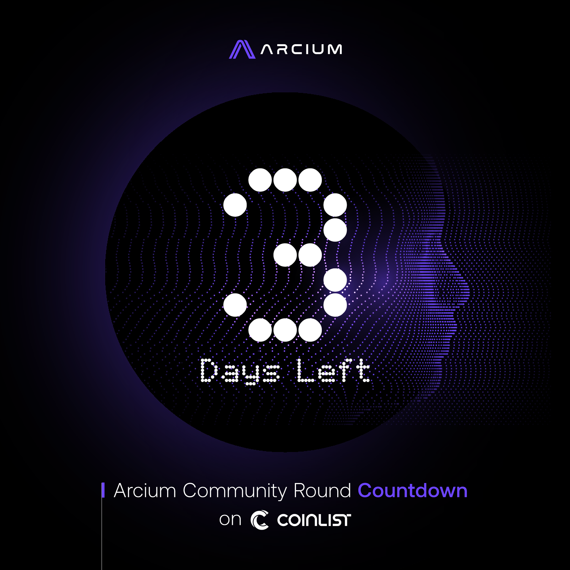
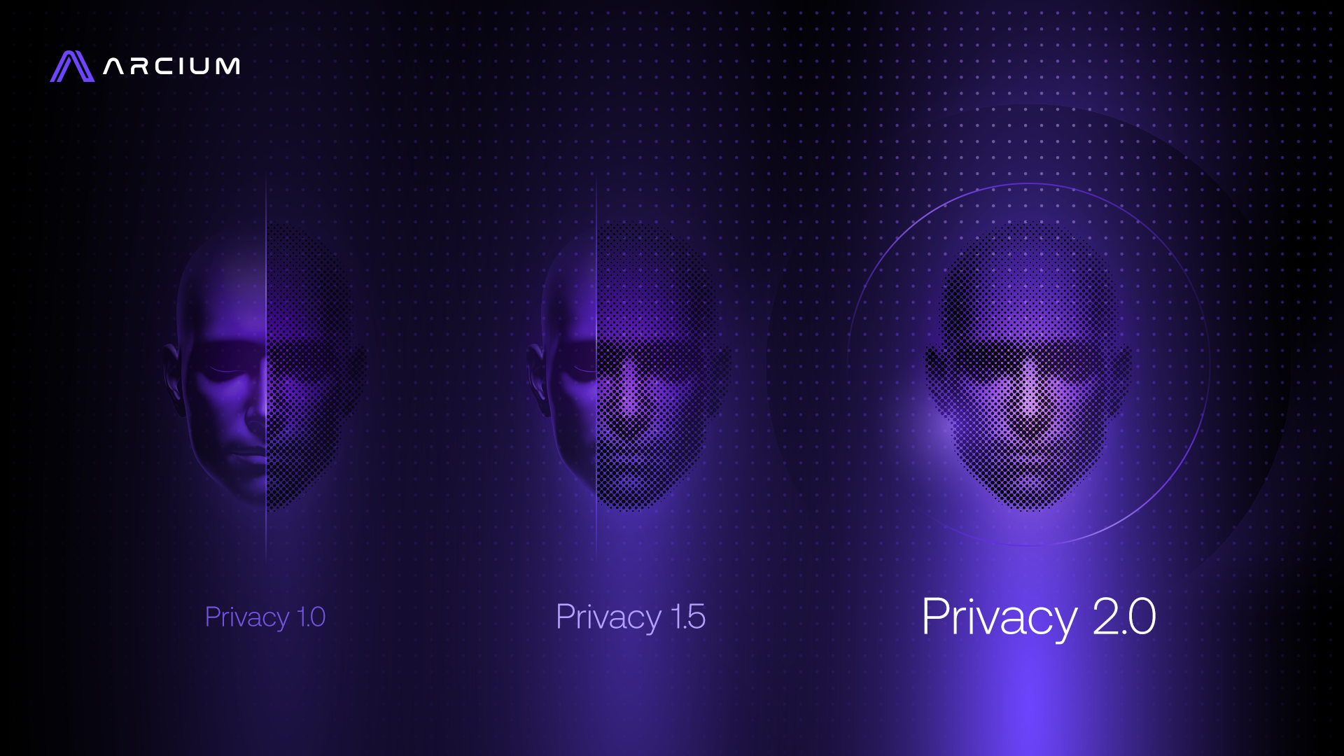
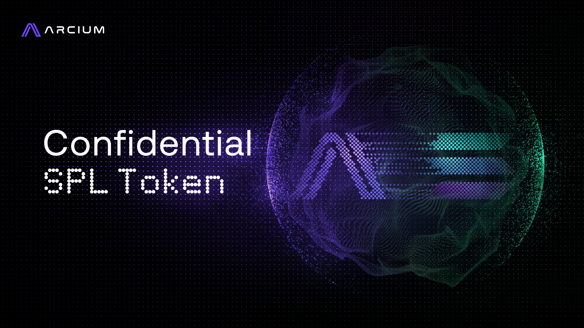
A curated slice of hundreds of designs, starting close to where Phase 1 left off, then growing bolder from there. A brand guide isn't a cage. This is what it looks like to follow one creatively instead of repeating it.
Event
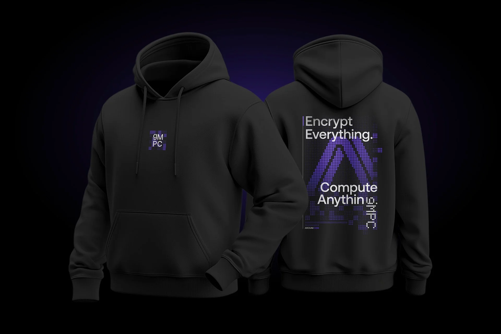
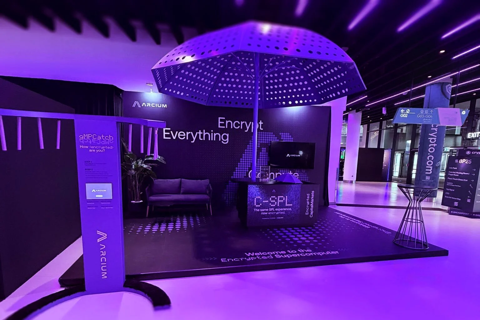
Global event experiences across 4 cities (Miami, New York, Abu Dhabi, Seoul): booth design, large-scale screen animation, and branded merchandise.